Here's my entry for SuperPunch's James Bond Art Jam, I figured a collector's edition luxury playing cards seemed like a good idea, with each one of the suits for one of my favorite Bond actors, one of their Bond girls and one of their villains. The cards have a matte finish on the backgrounds, while the suit, value and art have a glossy finish. -Joe D! & Jessica.
★ The Life and Times of The Internet's Very Own Joe D! ★
Showing posts with label superpunch. Show all posts
1.04.2012
★ James Bond Playing Card Collection ★
From my Flickr description:
Labels:
007,
d,
headquarters,
james bond,
jessica,
joe,
joe d,
playing cards,
Secret,
secret underground headquarters,
super punch,
superpunch,
superpunch art show,
underground
10.03.2011
★ American Gods Comic ★
American Gods Comic, a photo by Joe D! on Flickr.
Via Flickr:My entry for the SuperPunch American Gods ArtJam.
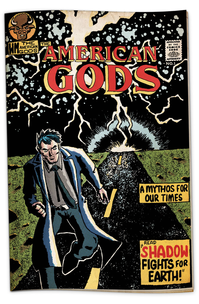
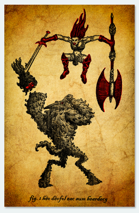
It's the cover for American Gods #1 in the style of Jack Kirby's New Gods. I don't know if it's noticeable, but I'd like to mention that I used the old Chemical Color Chart color pallet and instead of just using Photoshop's Color Half-tone Filter to make that Zip-a-Tone look, I actually separated each color and shade on to separate layers and applied them one at a time (all the tiny blue dots at once, then all the solid yellow, etc.) all trying to mimic the resources and workflow of Jack Kirby. I'm sure I butchered his art style, but it's great to get a look into how things used to be done and a find a new respect for the old masters.
I was only tangentially familiar with American Gods before this project, and after I did some research the American Gods/New Gods mash up idea crept into my head and I couldn't get it out.
If I can find out how, I'll upload the template I made with the historically accurate colors and Zip-a-Tone style process to my site for anyone else who wants to try this method, as well as a tutorial if I have the time. *UPDATE* I probably won't have time.
As usual, this was a blast and a great exercise in creativity. I can't wait to see what SuperPunch comes up with next.
Labels:
american,
american gods,
comics,
d,
gaiman,
gods,
headquarters,
jack,
jack kirby,
joe,
joe d,
kirby,
neil,
neil gaiman,
new gods,
Secret,
super punch,
superpunch,
superpunch art show,
underground
5.08.2011
★ Super Punch Contest:3DS Error Page ★
From my Flickr page:
This month's contest at Super Punch was to create a "Fail Whale" to replace the 3DS' "Red Screen of Death".
The directions were to makes something "delightful", however, the 3DS kind of creeps me out. Beaming a third dimension directly into your brain mush through your eye holes is neat, but probably the Devil's work, like cursive handwriting or Justin Bieber.
So I made the creepiest "delightful" thing I can think of. I'm just bummed I can't have "low growling sound" play quietly behind this image.
Labels:
3ds,
contest,
d,
error page,
joe,
joe d,
mario,
punch,
secret underground headquarters,
suhq,
super,
super punch,
superpunch,
where is your messiah now?
4.04.2011
★ X-Men: First Class Title Sequence ★
Description from my vimeo page:
Inspired by classic Sixties movie titles and prompted by John Struan of Super Punch fame, I've built a 1960s style title sequence for the upcoming X-Men: First Class film.
Set during the midst of the Cuba Missile Crisis, X-Men: First Class tells the story of the first team coming together, before they would become the heroes and villains we know from the original X-Men Trilogy.
This sequence was designed to give a very brief primer on the time period, the setting, as well as show the relationships of the characters in this film, as they are very different from the previous movies and audiences shouldn't be confused as to why Professor X and Magneto, enemies in the original trilogy, are the best of friend in this prequel.
Super Punch held a contest redesigning the posters for the film, which played it safe by sticking very close to the correlation to the original trilogy, and winding up rather mundane compared to the slick trailer rife with espionage, red fear, and 60s hair. Several people were quick to make posters in the Mod, Saul Bass, and James Bond style that I had in mind, so it was decided that I'd make a title sequence instead.
And yes, that music is a very melancholic rendition of the 90s cartoon theme song.
Please visit SecretUndergroundHeadquarters.com and SuperPunch.blogspot.com for more awesomeness.
Special thanks to Jessica Heaton, the World's Greatest Robot Girl.
The rest of the entries can be seen here
Labels:
contest,
d,
first class,
jessica,
joe,
joe d,
punch,
saul bass,
secret underground headquarters,
sixties,
suhq,
super,
super punch,
superpunch,
title sequence,
x men,
x-men
8.02.2010
★ SuperPunch Art Show ★
Posters based off the works of China Mieveille for John Straun's SuperPunch Art Show!
As usual, every image links to where you could download (free) full sized versions for yourself.
Labels:
armada,
art show,
china,
china mieveille,
d,
iron council,
joe,
joe d,
mieveille,
new crobuzon,
poster,
punch,
salkrikaltor city,
secret underground headquarters,
suhq,
super,
superpunch,
superpunch art show
5.30.2010
★ Red Sonja: Superpunch's May Art Contest ★
Superpunch threw an art contest ending in about ten minutes. So without further ado, here's my submission: a Baroque style woodcut of Little Red Riding Sonja & The Big Bad Wolfman.
The caption reads "She devil with a sword", the tagline on the Red Sonja comics.


Labels:
baroque,
contest,
d,
joe,
joe d,
punch,
red,
red sonja,
secret underground headquarters,
sonja,
suhq,
super,
super punch,
superpunch,
woodcut
Subscribe to:
Posts (Atom)


